A code review with NDepend Part 2: The initial review

For those who don't know, I am currently in the process of carrying out a full code review and improvement of some of our internal code using NDepend. To find out more about the quality measures that NDepend uses to analyse the code - read my first blog in this series!
Otherwise, let's press on!
So, once analyse your solution, you are presented with this page:
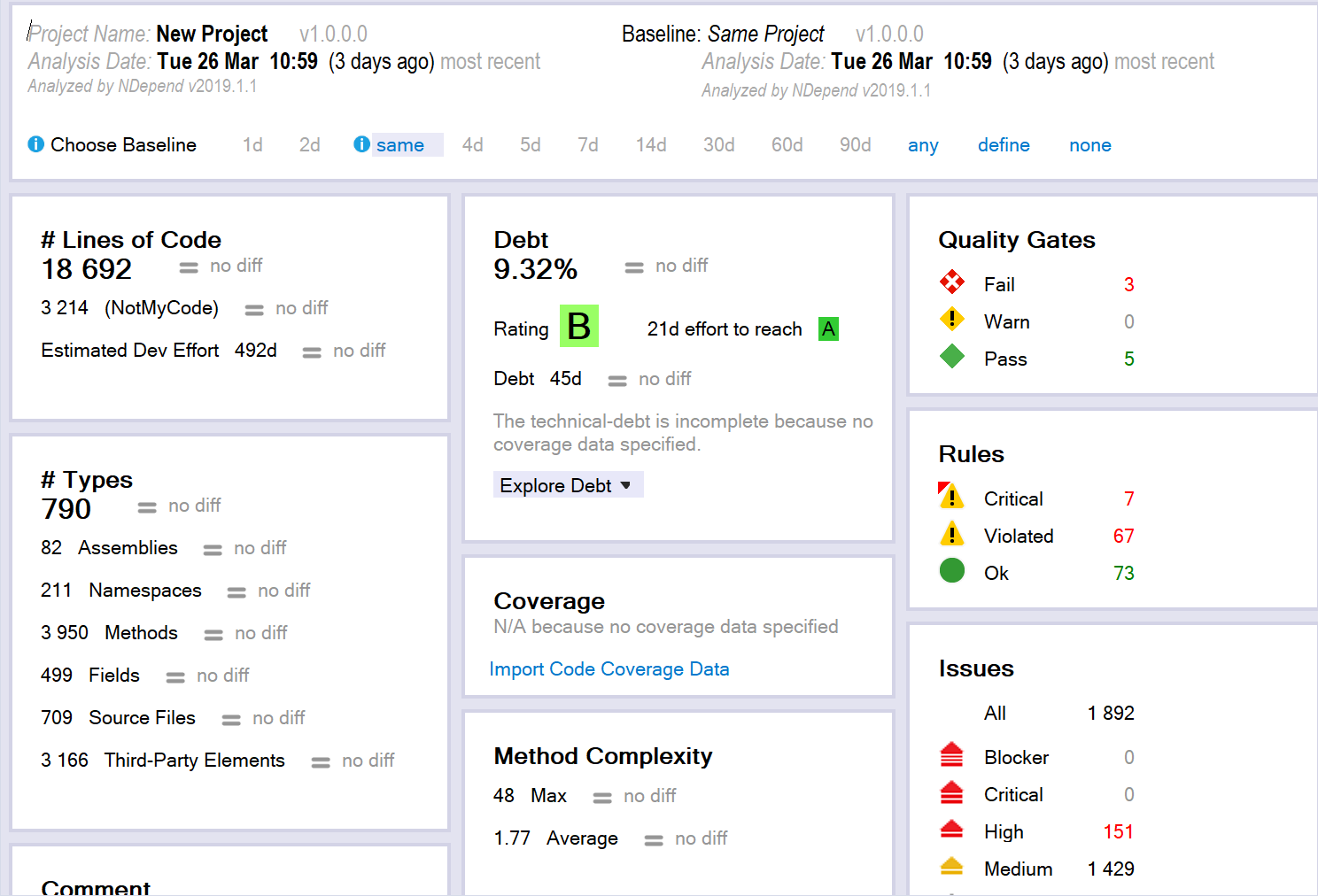
This has used the default rules to calculate the technical debt, time to fix each issue, quality gates, etc. Here the debt percentage is the ratio of technical debt compared to the estimated time it would take to rewrite the entire codebase (calculated from LOC). I.e. this states that it would take 21 days to reach an A grading for the codebase, which in 9.32% of the amount of time it would take to rewrite the entire solution (The formulae for these timings need to be configured to your teams' coding style, speed, etc.).
You can then drill down into the various rules/metrics which are defined. It can initially be somewhat alarming…
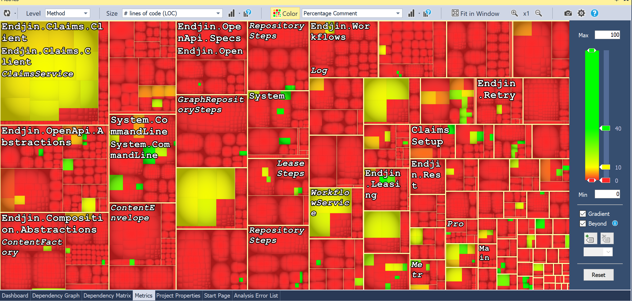
This is what it looked like when I chose "percentage comment" of methods (sized by LOC/method). However, this is mainly due to the fact that all of our documentation lives outside of the actual method body. When you analyse it by type it looks like this:
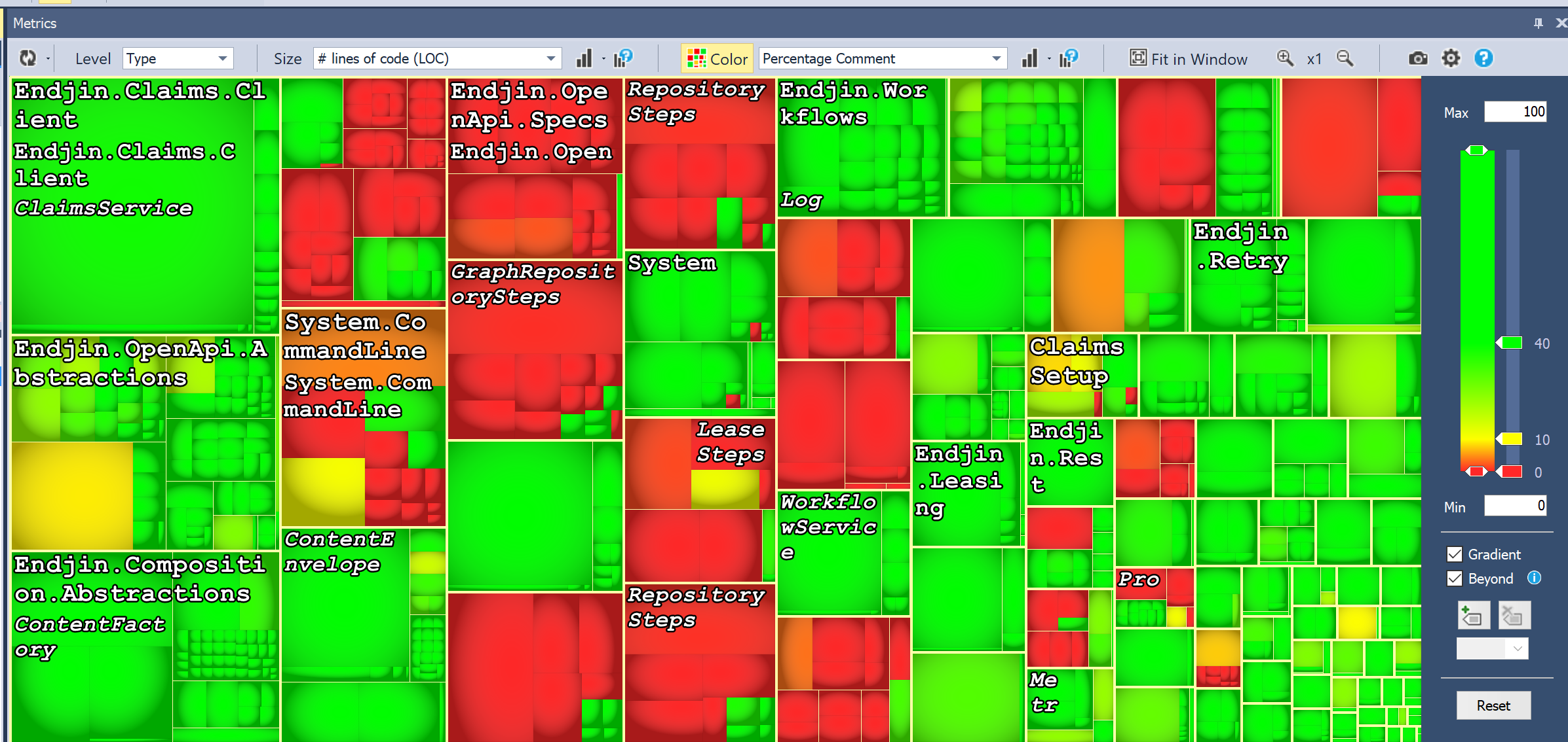
Now, this is slightly less alarming, but there's more. When I eliminate the auto-generated and specs assemblies, it looks like this:
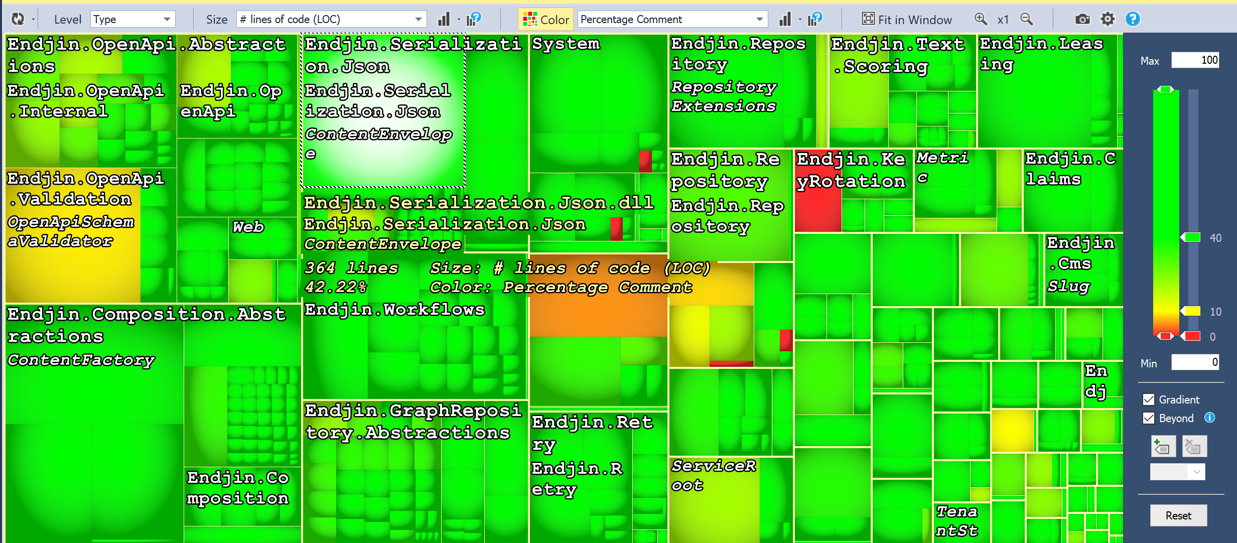
So, still a few places for improvement, but overall much more reasonable! My point here is that you need to tailor your analysis to your specific coding style. There are certain rules which may not apply to your code base (though I'd say that you'd need fairly good justification for ignoring most of them!). There are also some rules that you might want to be stricter on than the defaults due to cost constraints of making changes, or the consequences of bugs arising.
After removing the auto-generated assemblies, adjusting rules, etc. Our dashboard looked like this:
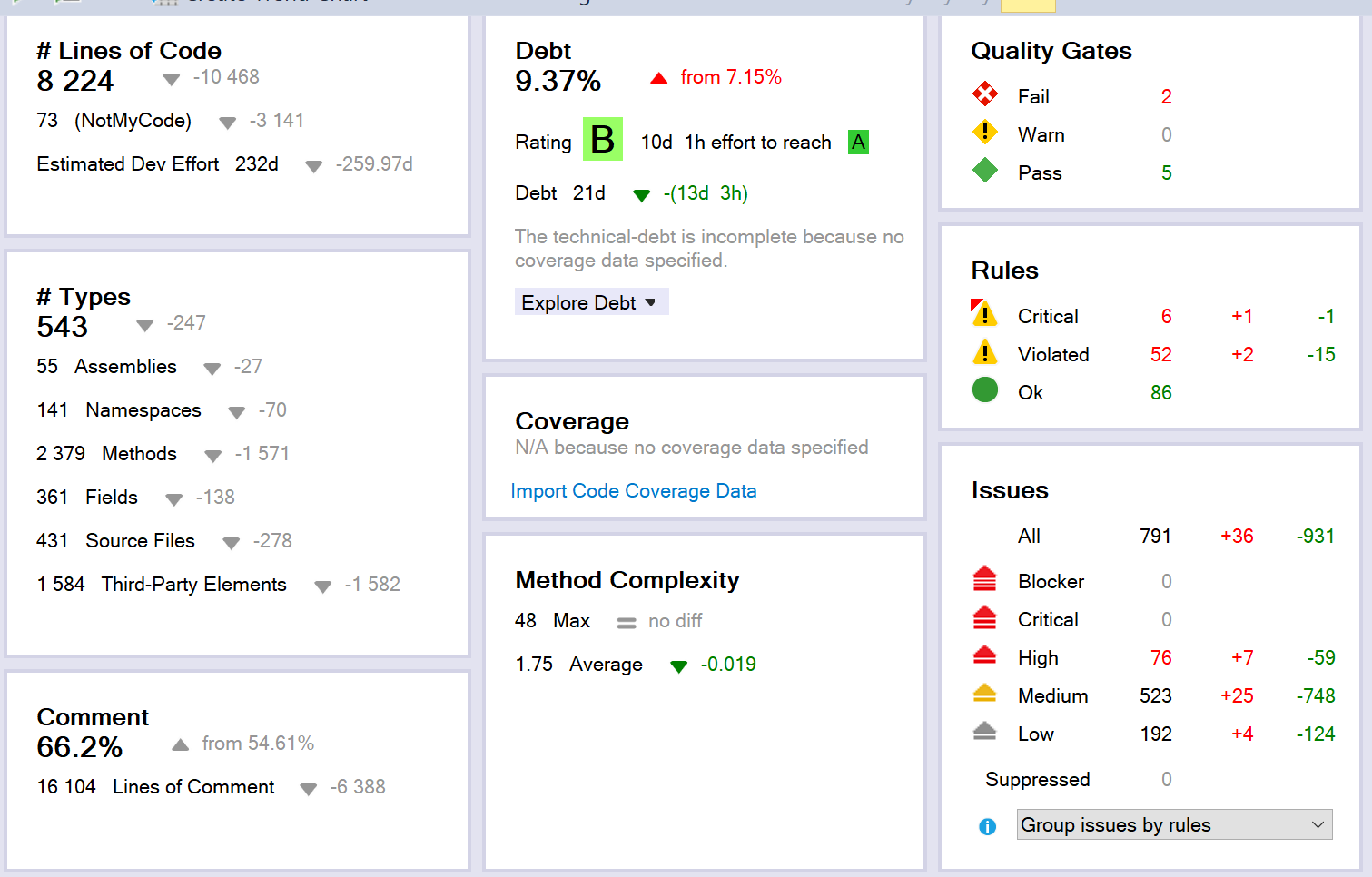
This dashboard is accompanied by graphs which show the change in your codebase over time. This can be extremely valuable (as we will see) for continuous analysis of a growing and changing solution.
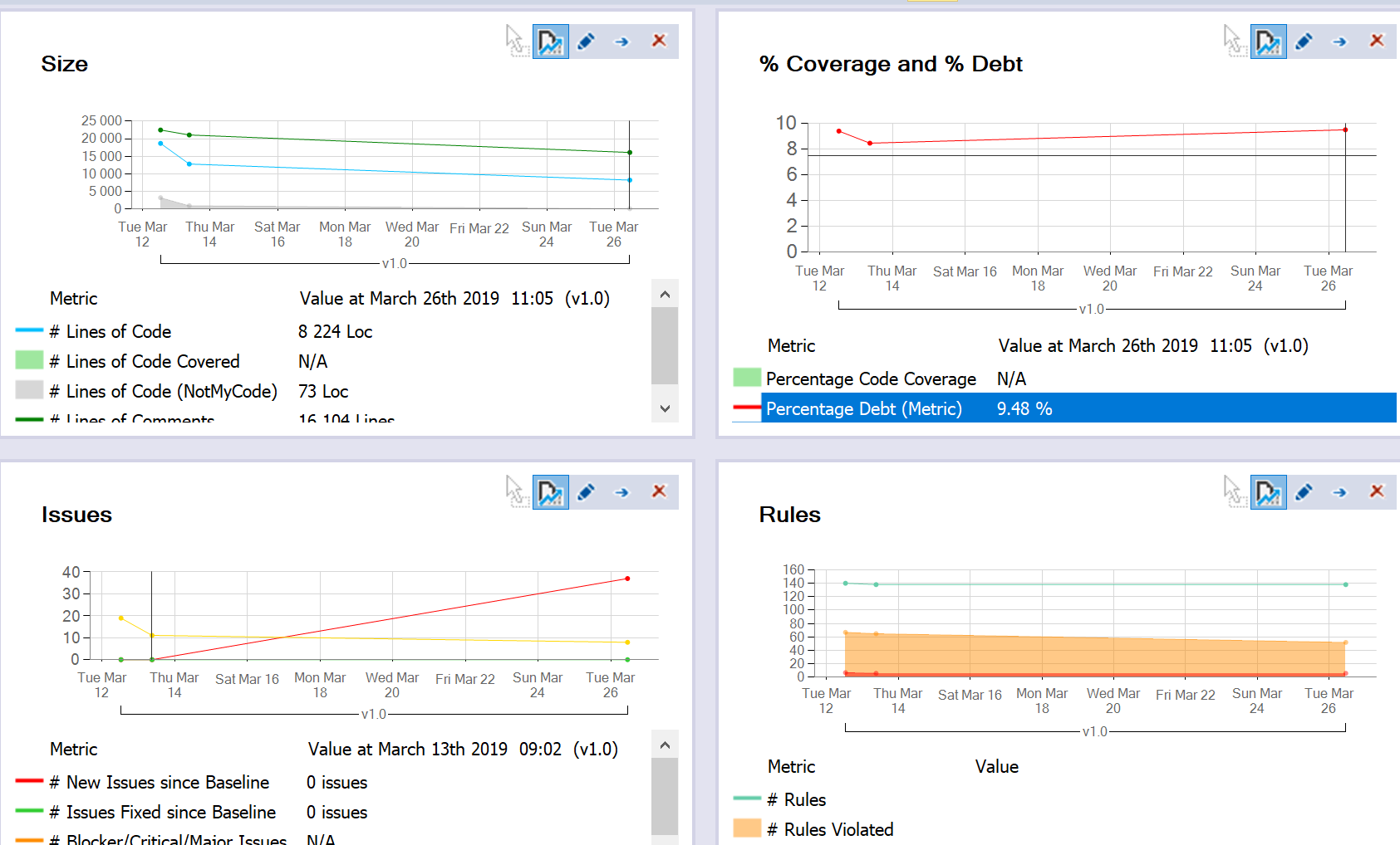
The data currently in these graphs is misleading, because the change is a result of me removing assemblies and adjusting rules, but you can see how the trend data will be displayed.
I should also note here that I did not spend a huge amount of time adjusting (for example I didn't adjust the debt formulae or those for the time taken to rewrite parts of the code). The formulae and rules can be customised massively. You need to decide how much time to spend refining them to your specific code base, I was mainly aiming to get stuck in on some improvements ASAP!
So, with this in mind, let's have a look at some areas we could focus on… I thought that the logical place to start was at the "failed" quality gates, after all, that seems pretty key…
So we have:

Focusing in on the "critical rules" (as those are, you know, critical):
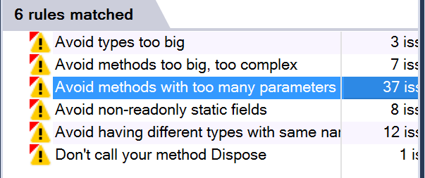
My focus for the next part of the analysis will be on addressing the concerns raised by each of these rules. This does not, however, necessarily mean that I will be making corresponding code changes for every single one. The next step is to create work items for each issue raised, and have some internal discussion about the best way to address the issue, or around justifying the existing solution. For each violation, we will then either have fixed the underlying problem, or provided justification for suppressing the rule in this instance.
This seems like a good to do list to be getting on with so… Stay tuned for my next update!


